Print design: it matters how you say it.
We’ve all been to movies after which we’ve said, ‘The book was better’. Why do we say this? How can a book, which is just black marks on paper, have a more profound impact on us than a movie, which engages so many more of our senses?
I ask this, because in the world of hyperactive media (DVDs, the Web, digital TV) it is easy to be less than confident in the impact of printed material.
I’d suggest that print has these advantages, amongst others.
- Readers can engage with printed pages. They can take time to think about them, re-read them, notate them. They can make them theirs.
- Printed items do not rely on other technology. A reader can access the world they portray simply by looking at them. They are completely portable. No power leads or batteries required.
- Someone has said that the printed word is as close as we get to telepathy. It conveys thoughts from one mind to another, pretty much directly. And, if the writing is good, it can feel that way.
Once you have decided that print is the way to go, ask me if you would like help with some polished, compelling writing.
So why is design important?
Design organises words and images so that readers understand their relative importance and find their way most simply to the information they want.
It also helps set the mood for the writing. Serious. Luxurious. Friendly. Playful. Hip.
It’s no longer true to say that you can’t judge a book by its cover. You almost certainly can. Think of the movie posters. They can instantly tell you whether a movie will be your cup of tea.
A small example of print design in action
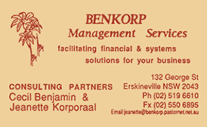
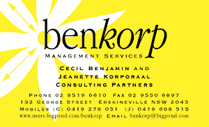
When Benkorp came to me for a corporate stationery redesign, they had already chosen a picture of flannel flowers. I created a stylised flower head as a metaphor for the multiple services Benkorp offers to small business.
This design was the basis for a new letterhead, moving cards (the details on Benkorp business cards are now different), a website and even the exterior of the Benkorp building. (You can see the flannel flower mark on the current Benkorp website, but it was put together by an assembly-line web hosting company. Sigh.)

The card Benkorp wanted improved

The Benkorp card after my redesign
The revised card’s visual hierarchy is simple and clear. It speaks of a professional company with a friendly, vibrant relationship with its clients.
Getting it printed
As a designer of sixteen years’ experience, nine of them in my own business, I know some excellent printers who are able to deliver jobs according to your needs, whether quality, price or speed of turnaround. You may wish to ask me to take care of this for you.